Campaign Benchmarking
The problem
Through voice of customer survey results, we learned that campaign benchmarking features were the number 3 request from marketers. Customers wanted know how their marketing efforts compared to businesses like theirs.
The approach
Build a foundational MVP that provides industry benchmarking data for customers within a key industry
Challenges
Key challenges included limited resources for research and a complex tech stack, combining stateful web architecture with modern music tech libraries.
Impact
Statistically significant feature adoption and boost in email campaign sends post-MVP launch
Company
Role
Product Design Lead
Responsibilities
UI/Visual Design
Prototyping
Interaction Design
Concept/usability testing
Data visualization
Team
Product Manager
2 Full-stack engineers
1 Backend Engineer
1 QA Analyst
Researcher
Year
2020
Concept testing
We started with a hypothesis and some quick concept testing rounds to make sure we were on the right track

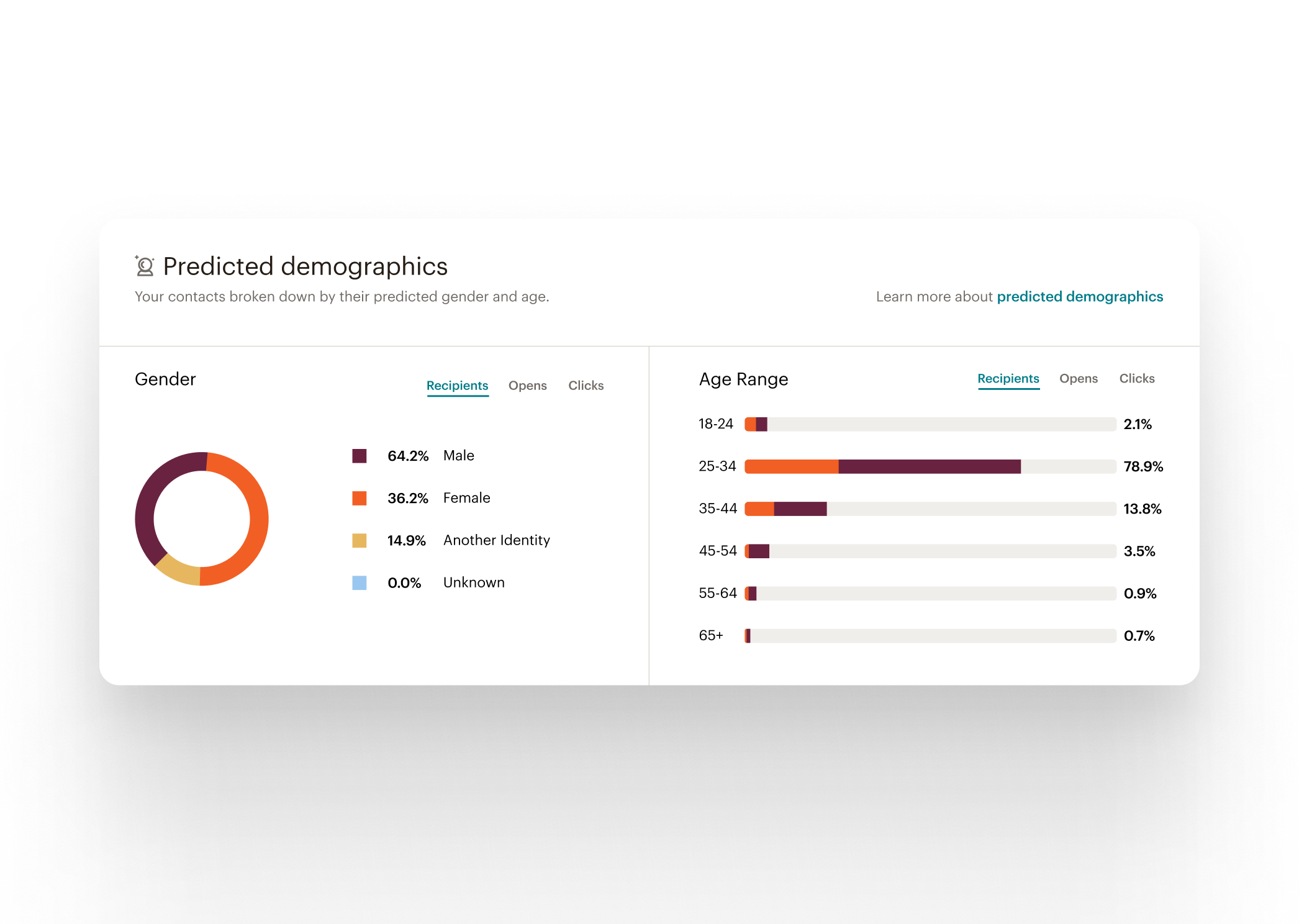
Predicted demographics
We leveraged a feature we shipped earlier in the year as one of the key ingredients.
This allowed us to surface key insights about the users' audience when showing the campaign benchmark
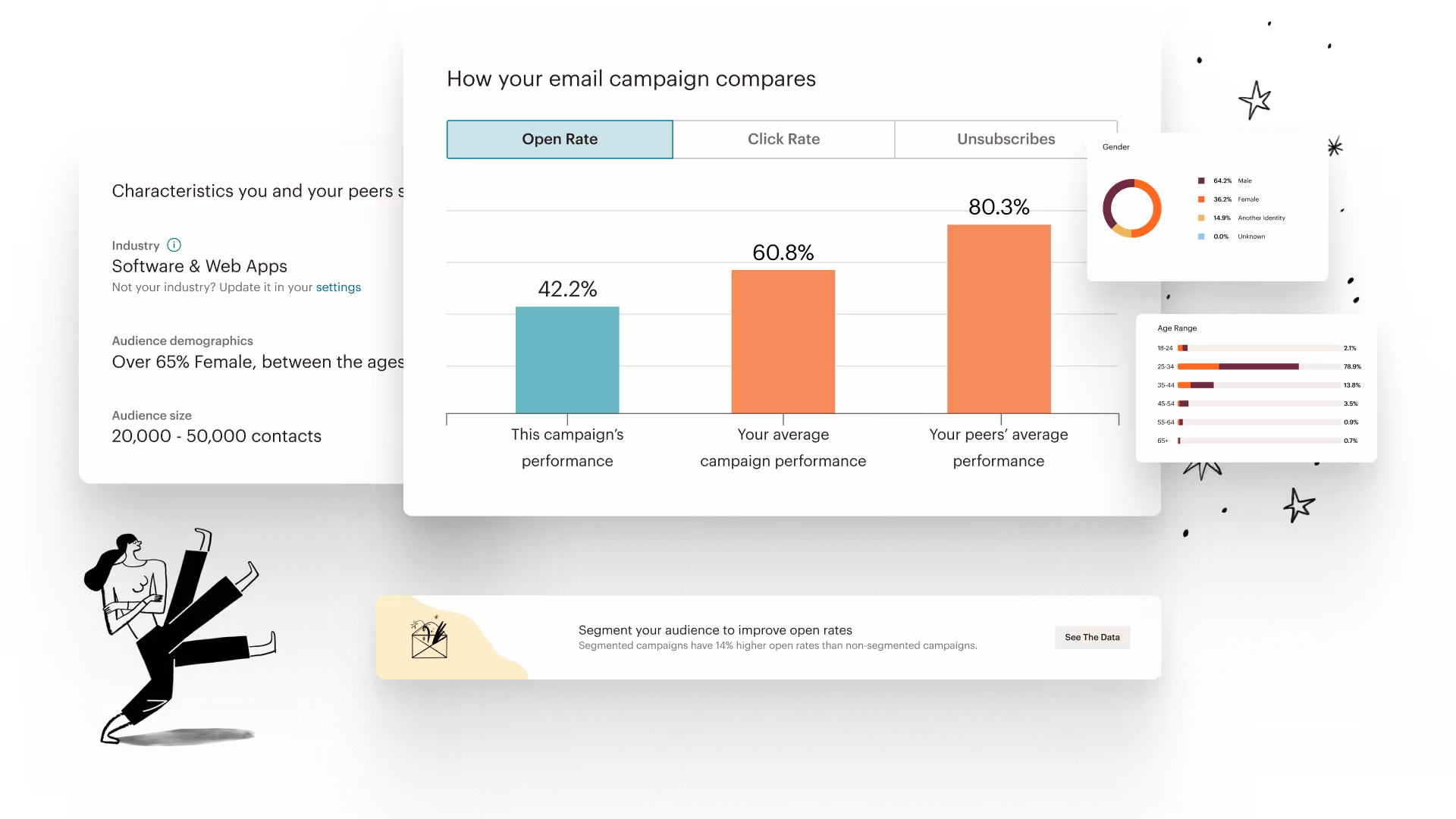
Business vertical
We used machine learning to analyze content across thousands of campaigns to effectively predict the customers’ business vertical and find benchmarking data to compare against.

Data visualization
Several iterations of data visualization were explored to represent the benchmarking data. I worked with our design systems team and data scientists to narrow down the optimal presentation.


Recommendations & celebrations
We enhanced our feature with a recommendation system that provided guidance based on the results of the campaign. For instance, if the campaign remains unopened, our recommendation would be to re-send to those un-opened contacts. When the campaign performed above industry averages, we celebrate with a welcome message.

Empty states
We didn't want empty states to be a blocker for customers to start seeing benchmarking data. A quick feature summary and a clear call to action gives users a clear path to access.